RENEW
MEDICARE SHOPPING WEBSITE
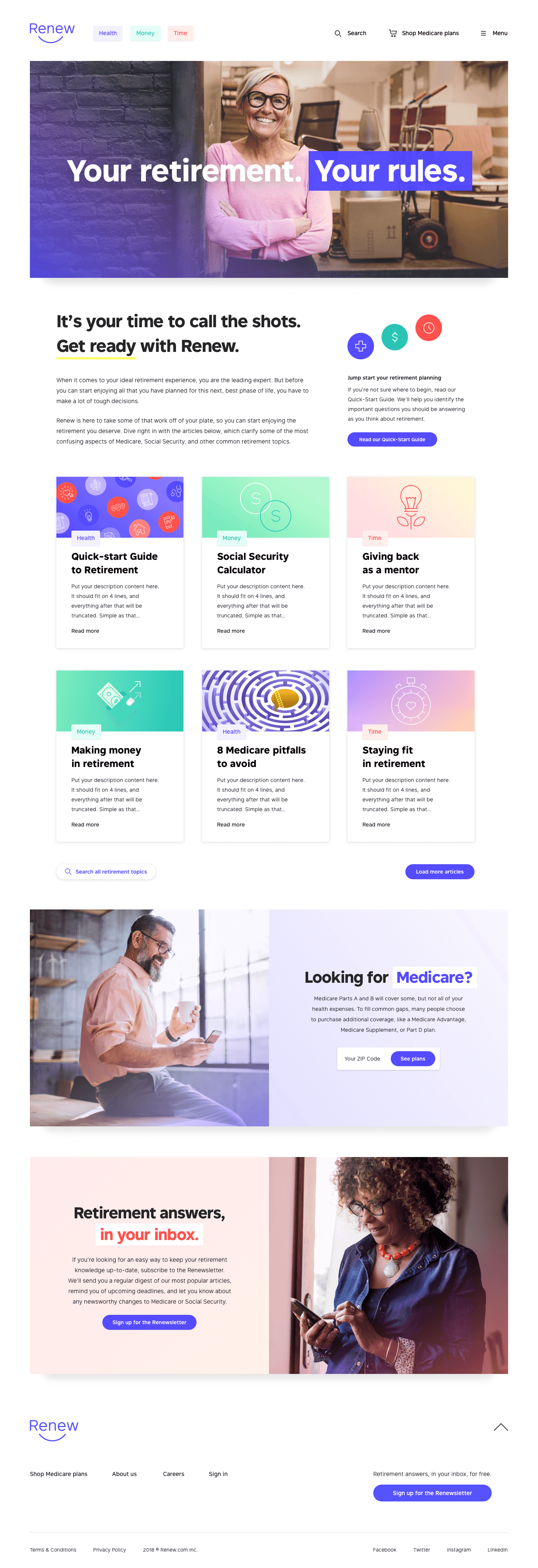
Renew was a startup whose mission was to empower retirees during their transition to retirement. My responsibility was to understand the motivations underlying the retirement decision and how it affects Medicare plans shopping. Here's how I utilized choice architecture to create a decision-making user experience and applied it to a Medicare shopping website.
DISCOVERY
Through user research, I discovered that the retirement decision is an emotional event that includes behavioral aspects such as framing effects, hyperbolic discounting, affective forecasting, and cognitive biases. I also learned about retirees' values, behaviors, frustrations, and motivations. I used this information to create personas and a library of insights based on this information (a few examples below).
3
factors were important when choosing Medicare plans: provider, coverage, and cost.
63
is the average retirement age.
48%
of seniors would be willing to use wearables.
22%
of users start thinking about retirement a year before they do.
19.2
average number of prescriptions for patients between 50 to 64 years old.
DEFINE
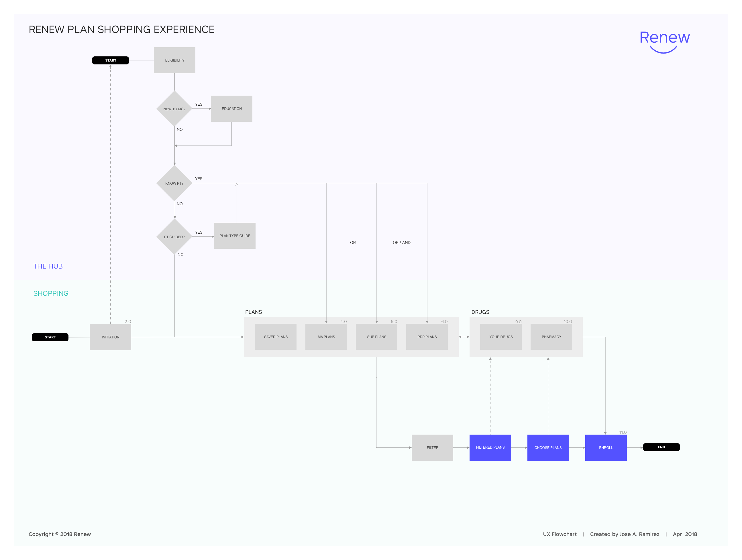
At Renew, we saw retirement as a balance between wealth, health, and time. Retirees identified health as their number one priority, including Medicare. I learned that Medicare shopping was complicated and seized the opportunity to simplify it. My approach was to divide prescription drugs and Medicare plans into different sections. It was a radical idea but one that would disrupt medicare shopping. Here are some artifacts produced during the Define phase.
DESIGN
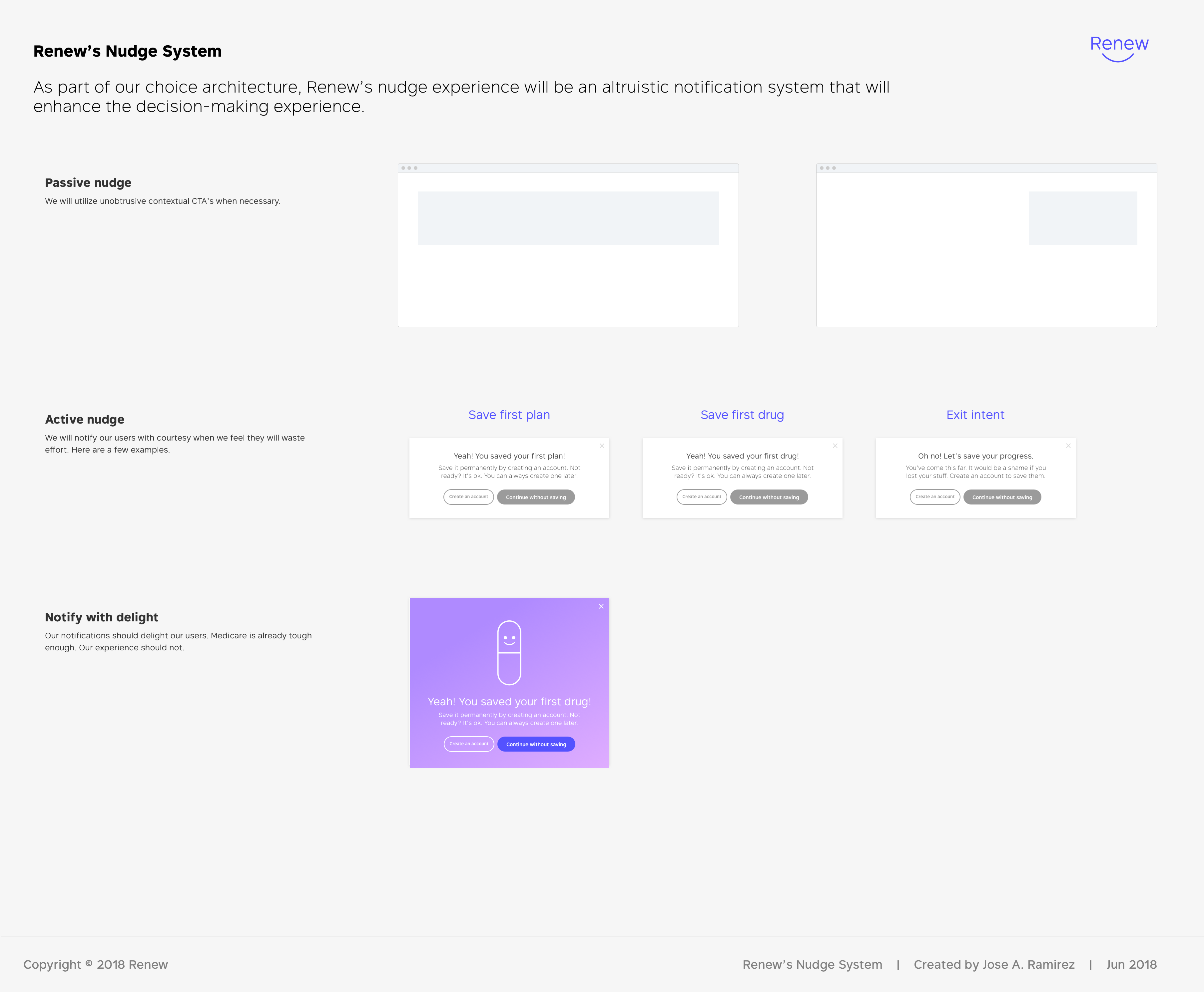
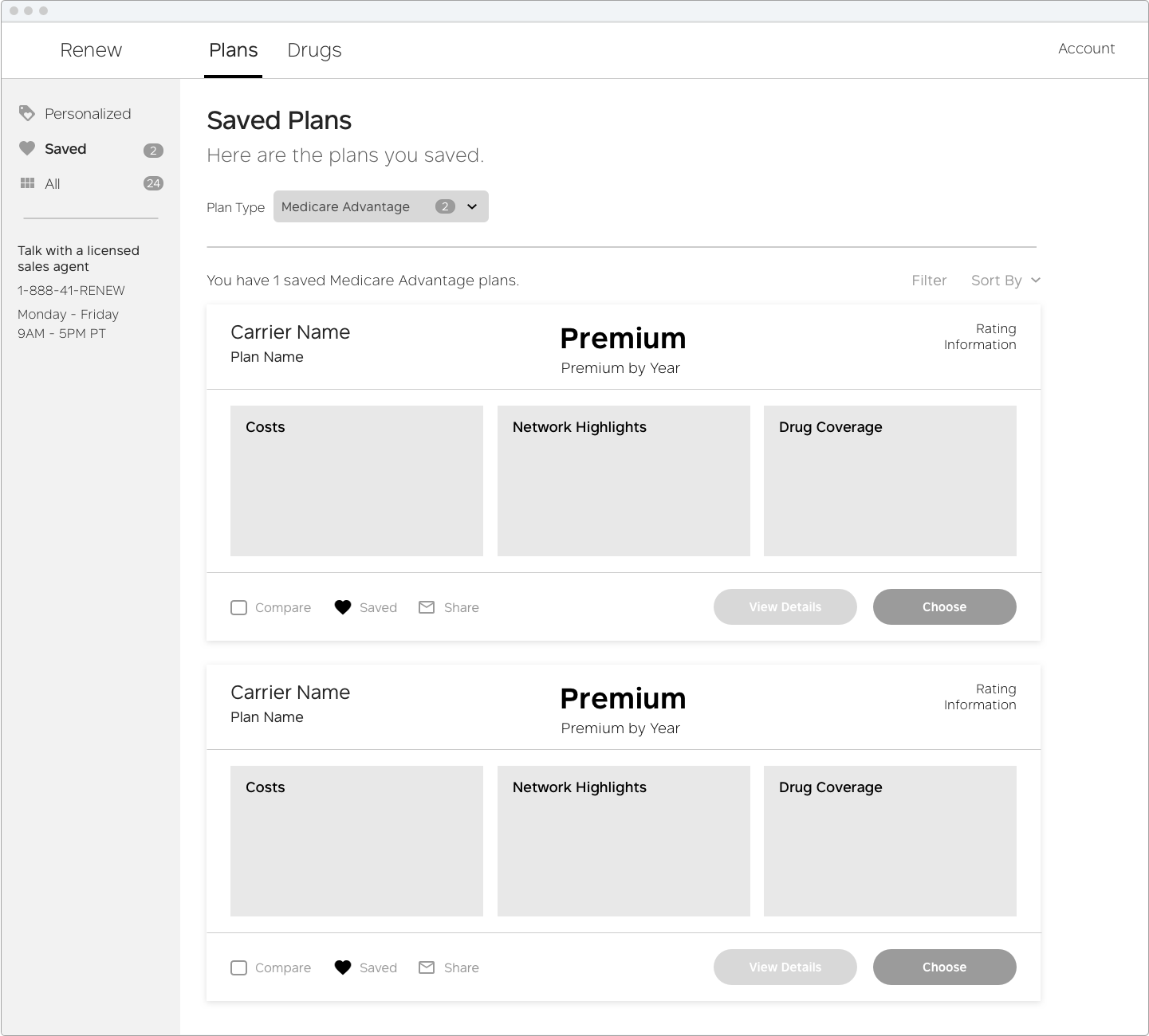
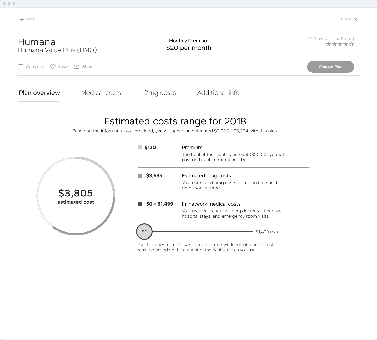
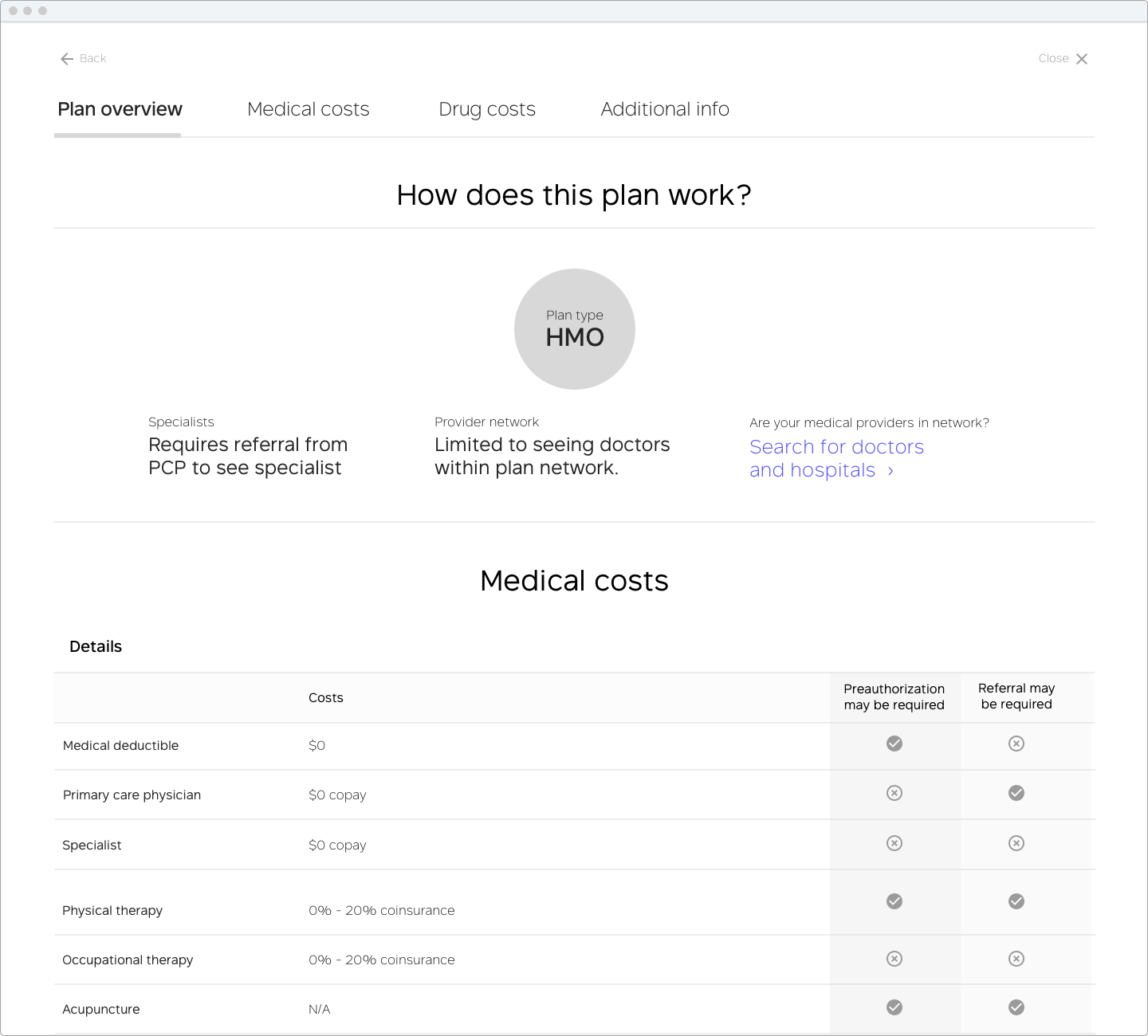
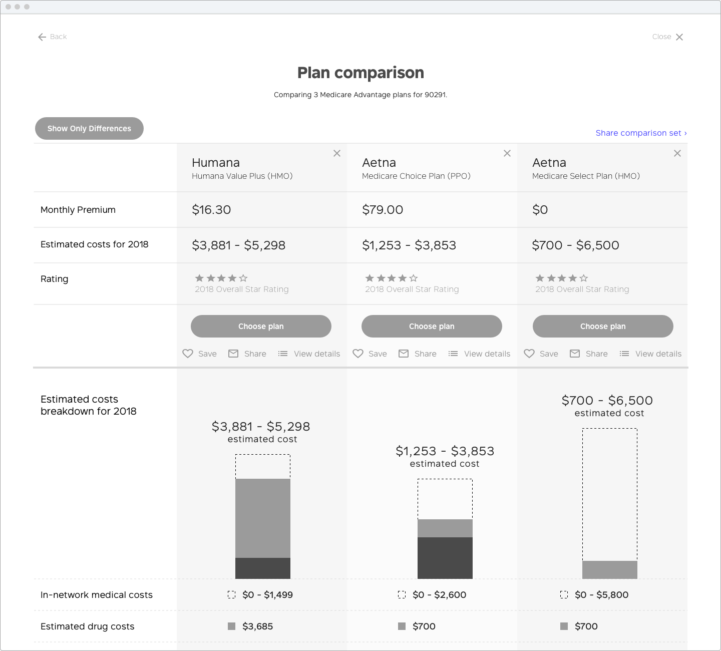
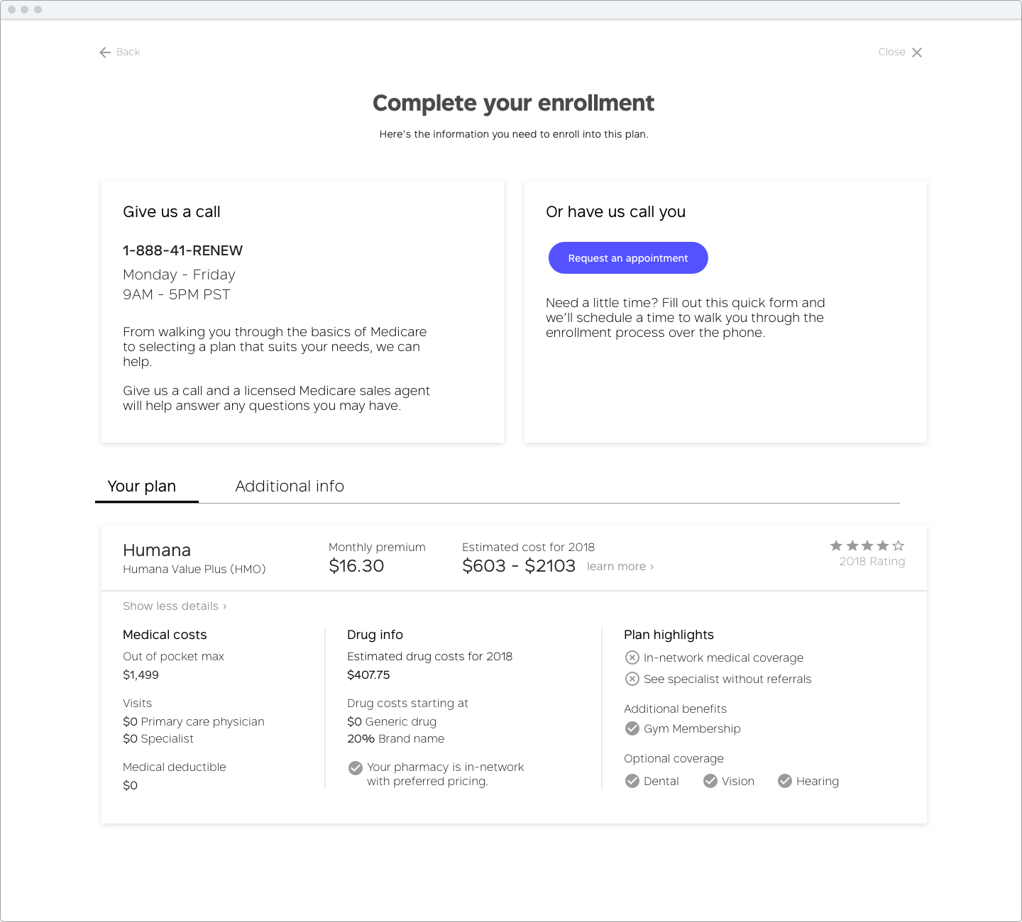
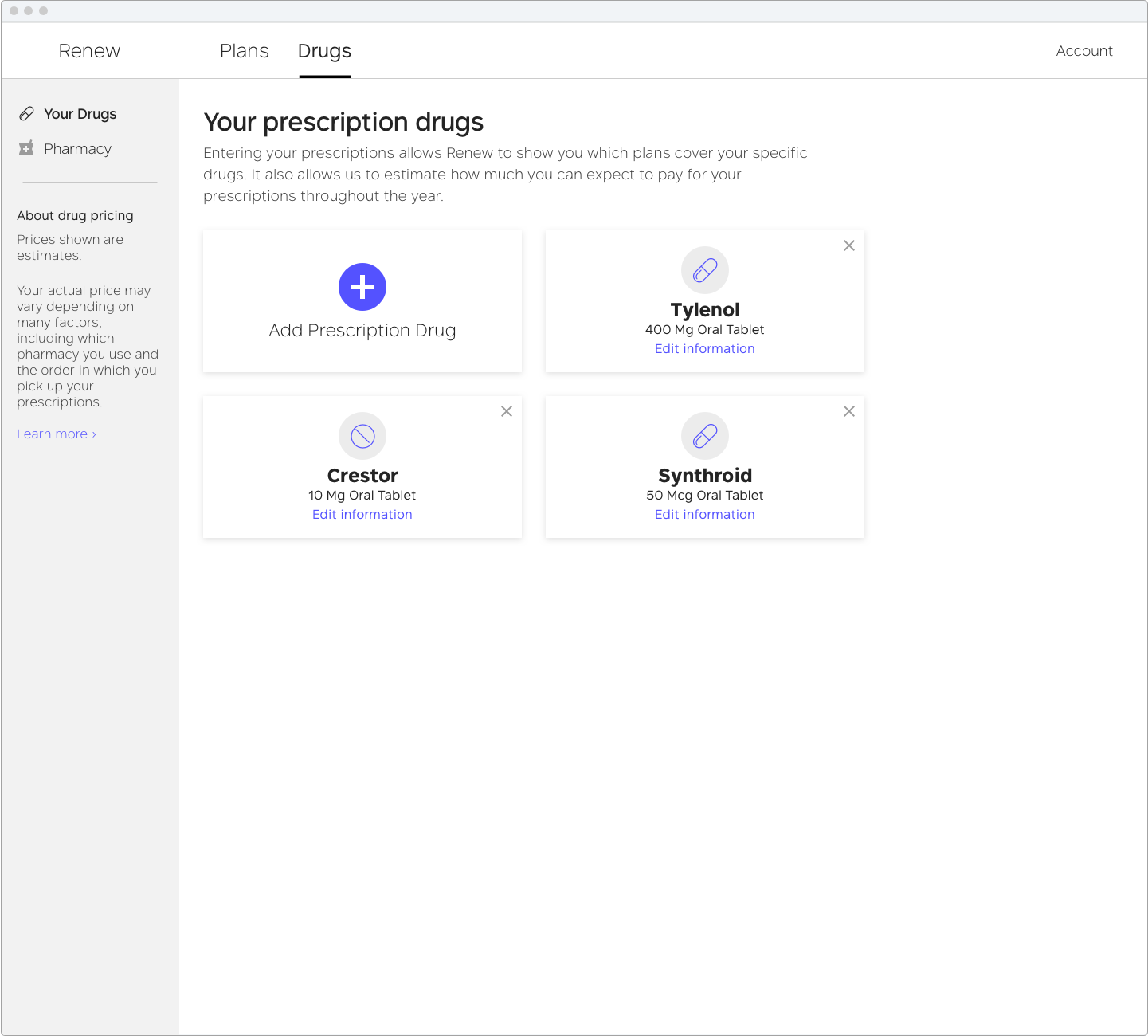
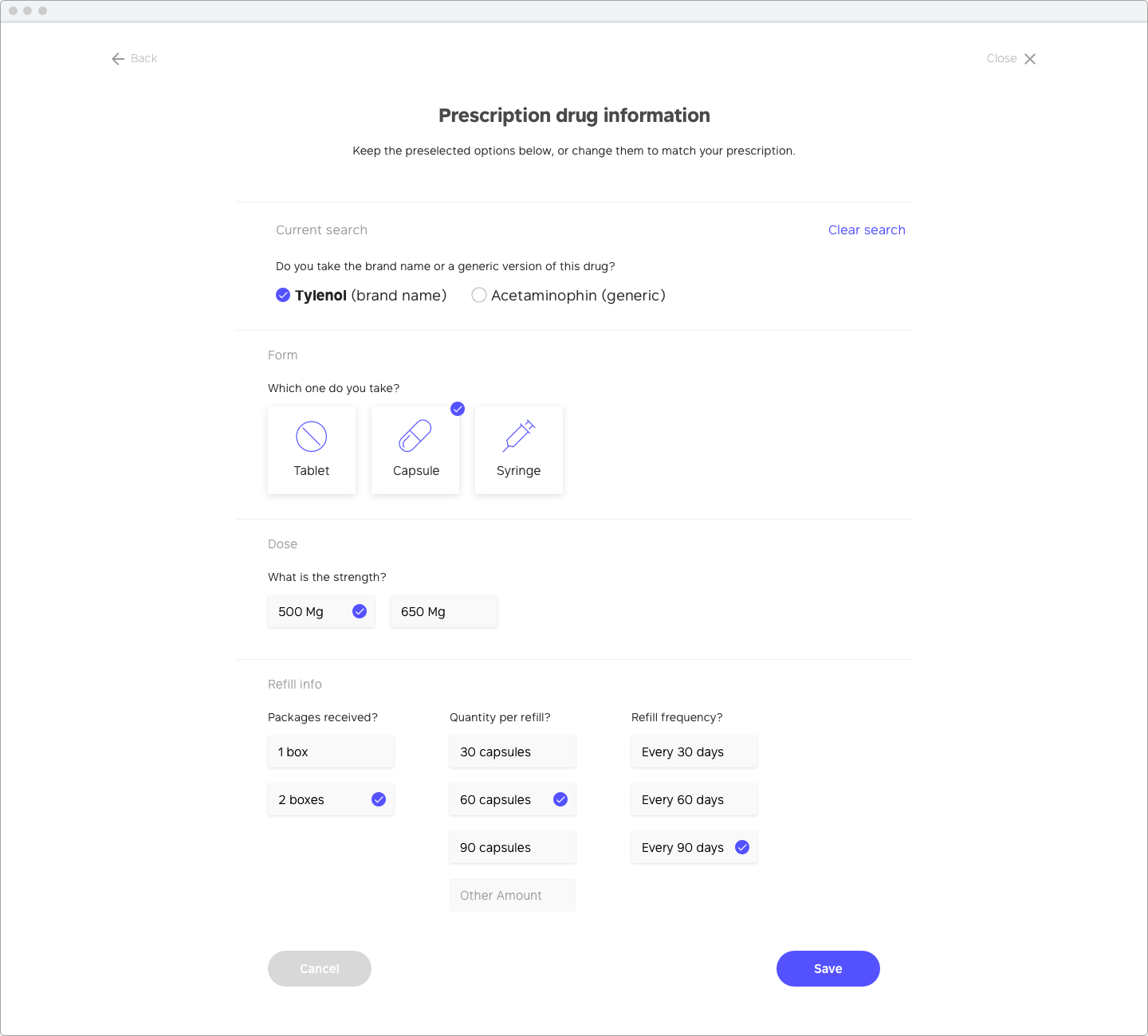
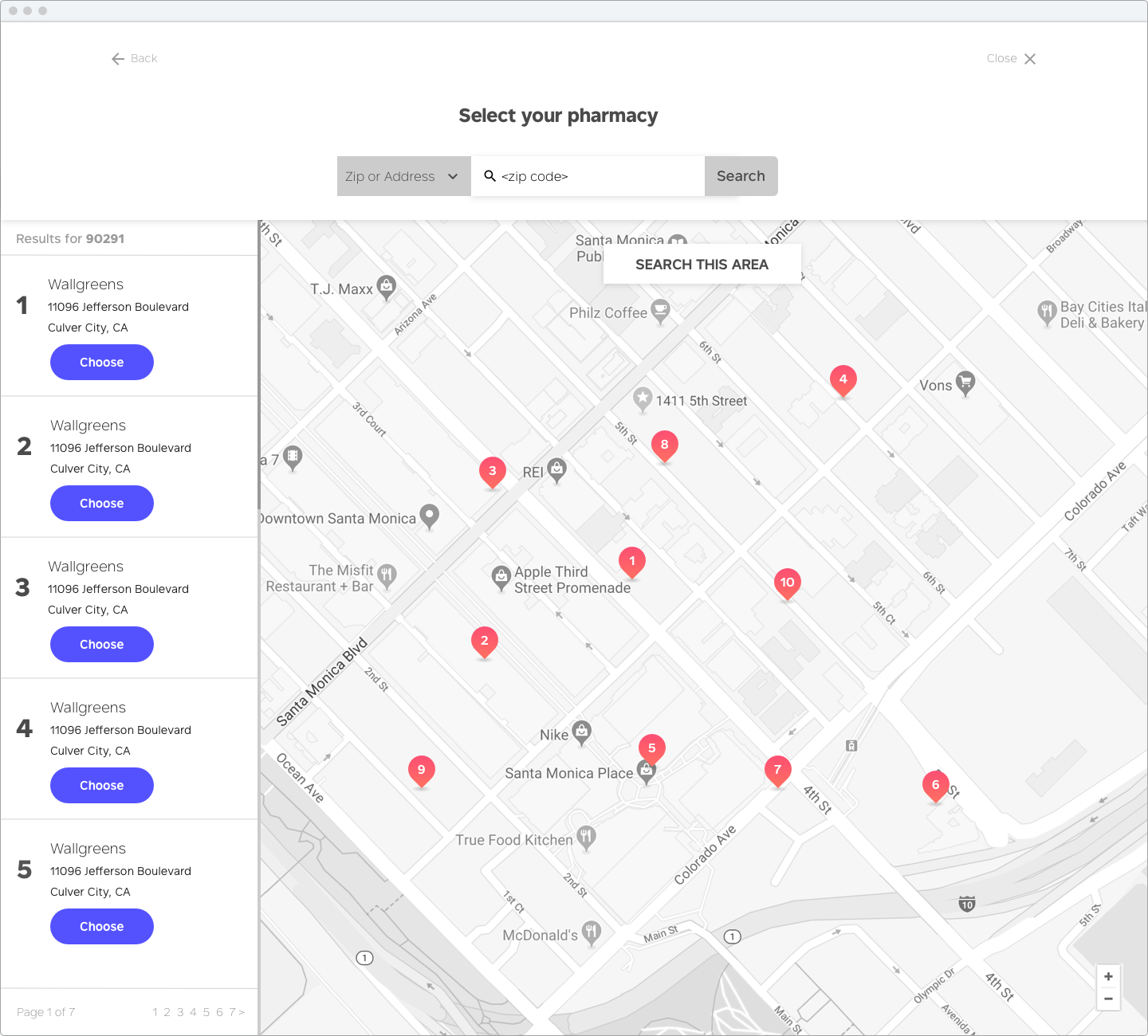
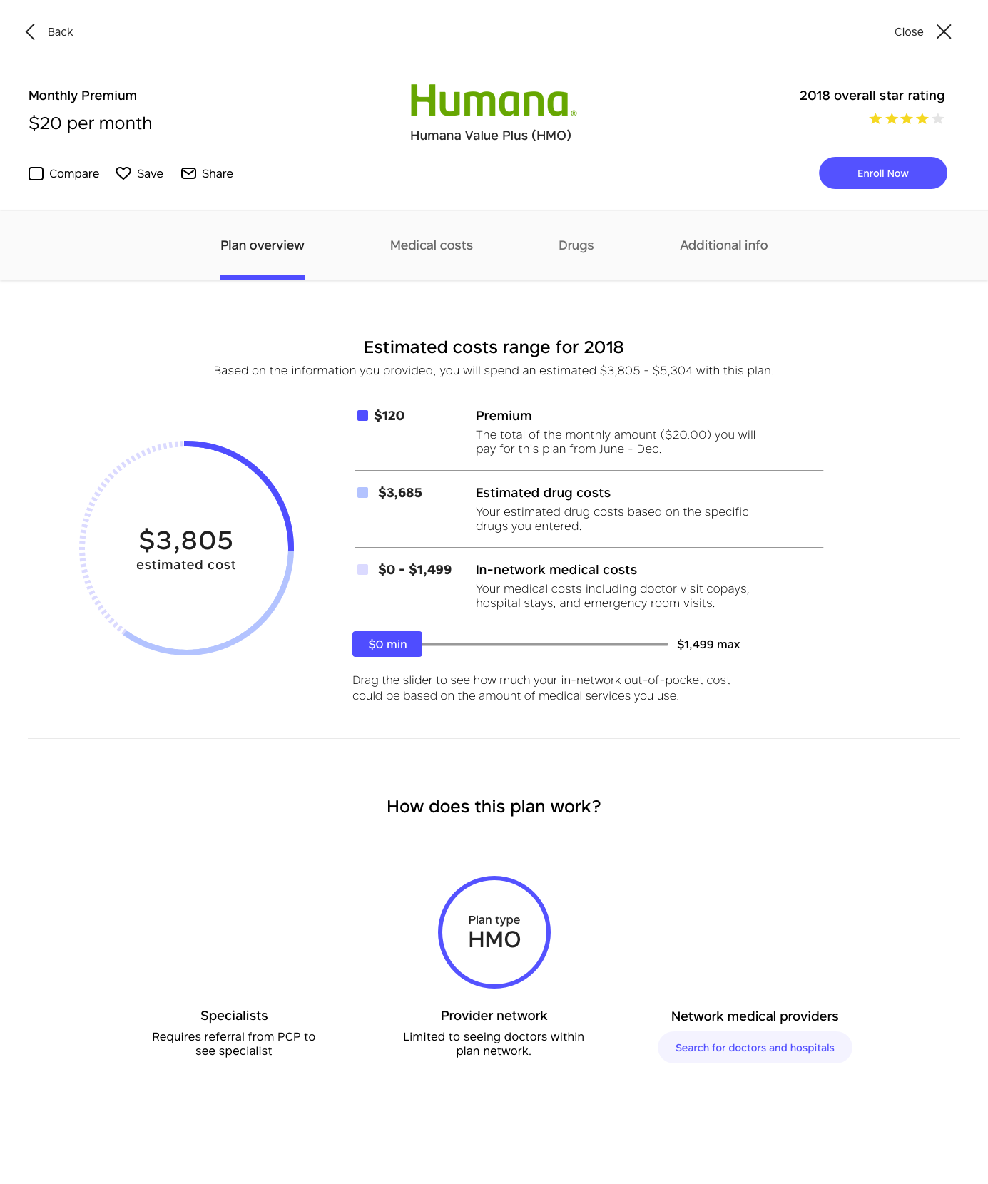
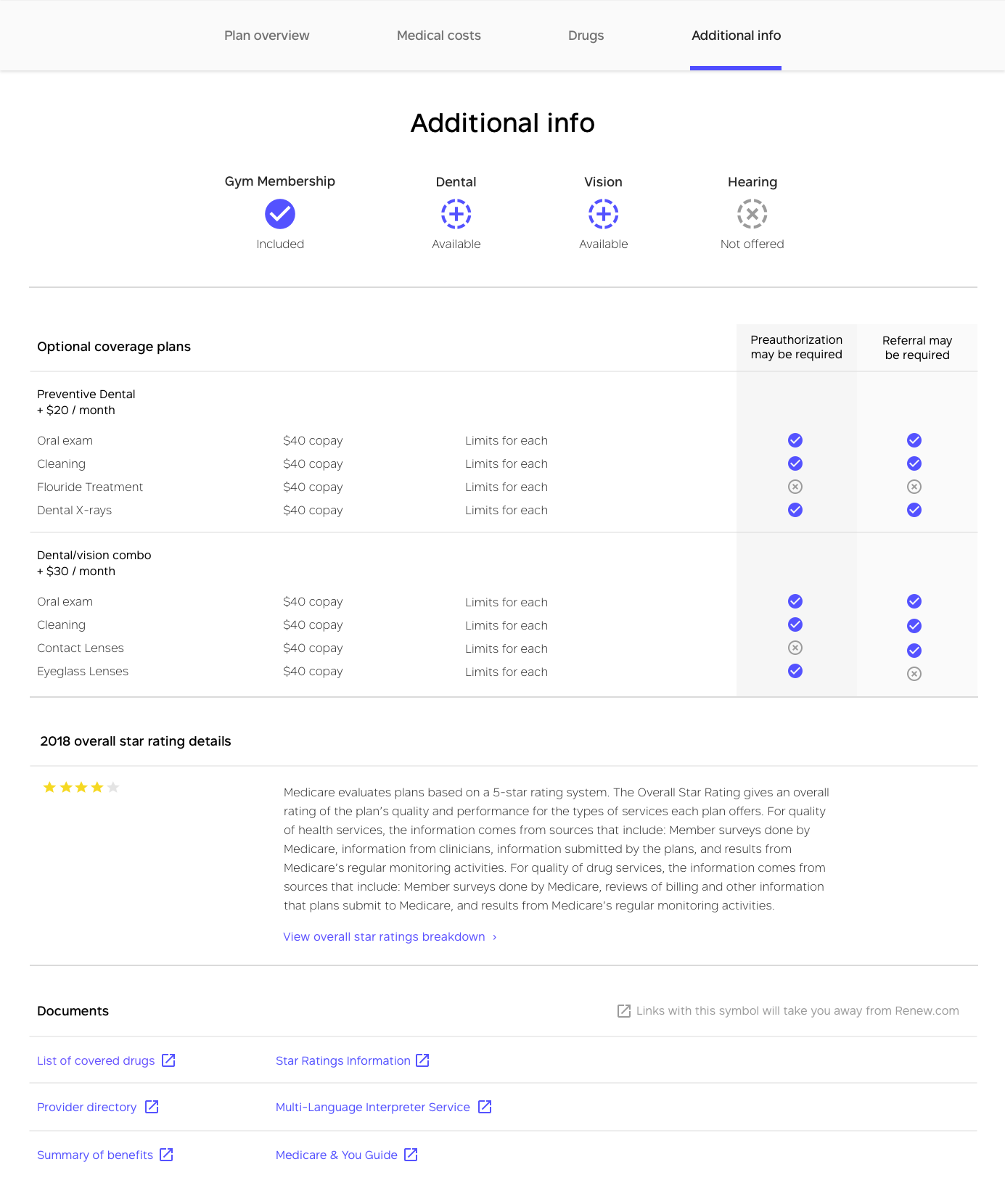
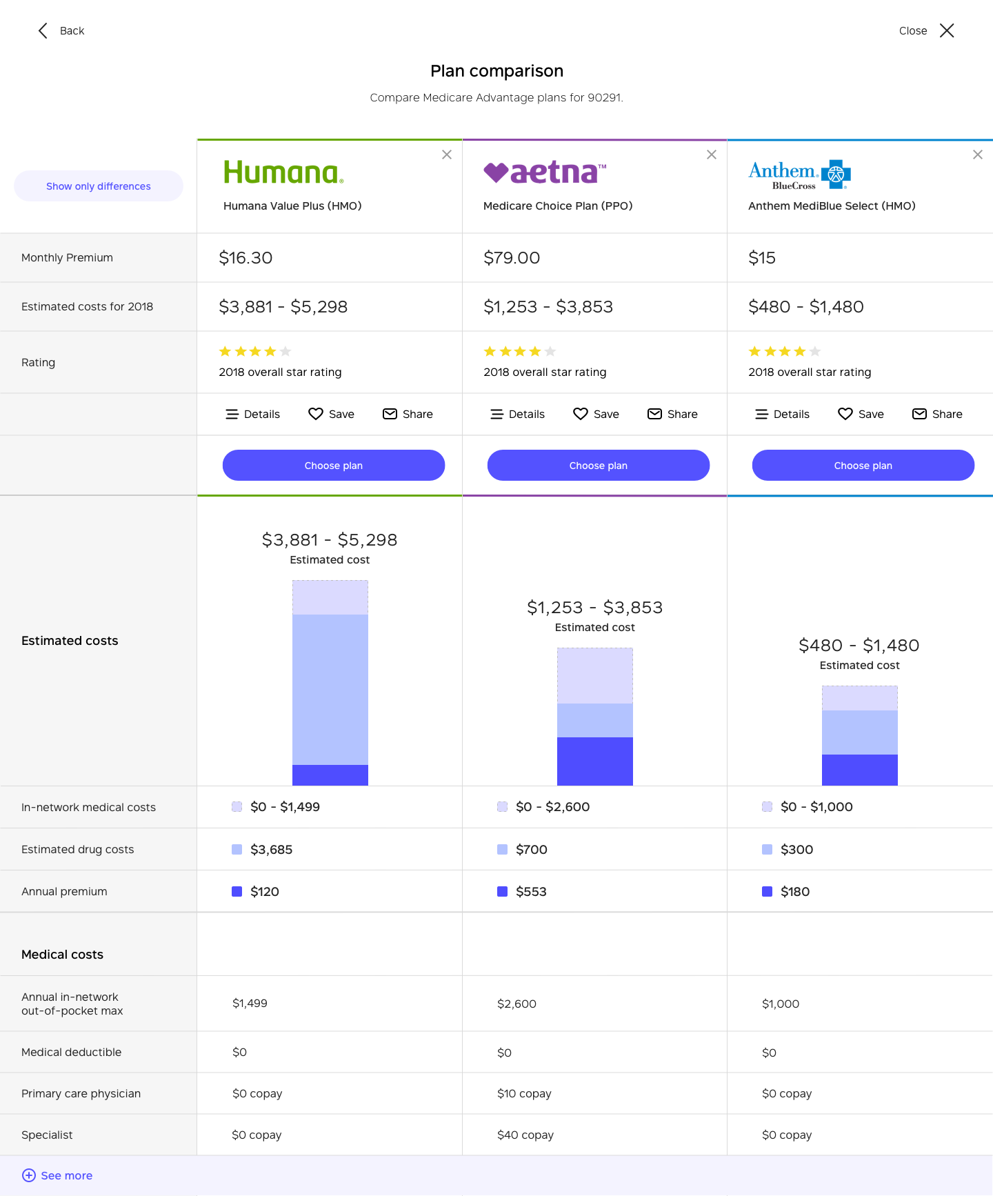
I explored and conceptualized calculators, Medicare card designs, explanation of benefit interaction models, and prescription drug flows. My designs had to help users overcome biases. More importantly, the experience had to foster confidence in their Medicare plan decision. Here are some wireframes I created that describe the various stages of the Medicare shopping experience.
EXPLANATION OF BENEFITS
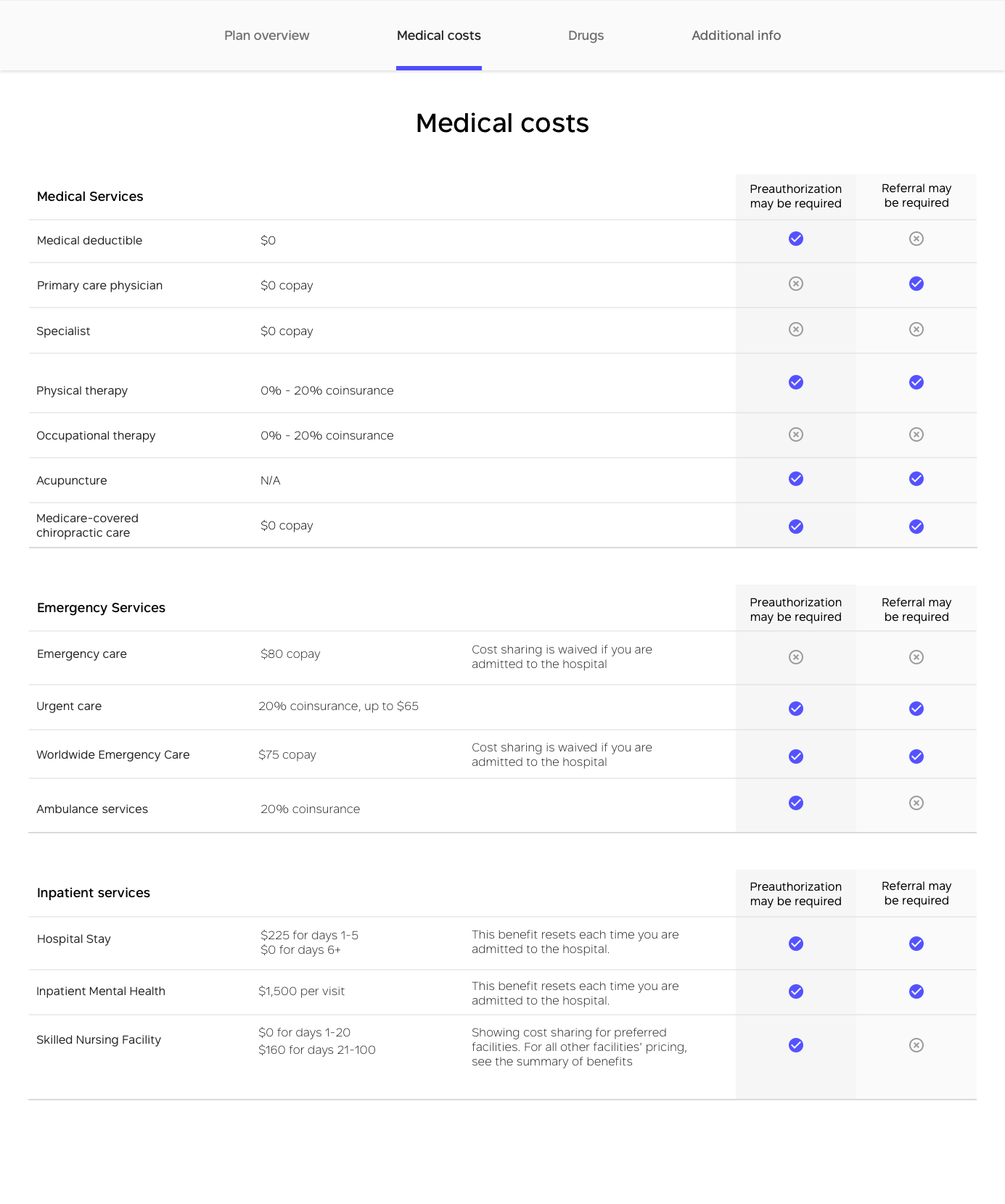
A particular challenge was to balance content with tools that would help users understand benefits. Since I was new to Medicare, the curse of knowledge did not hinder exploration. After many iterations and user testing, I created interactions that explained Medicare benefits and engaged and delighted users.
DRUGS
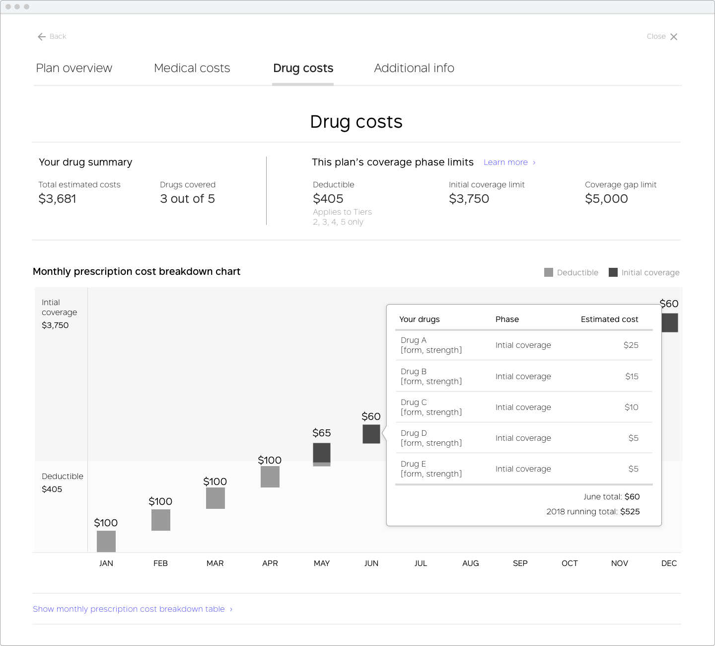
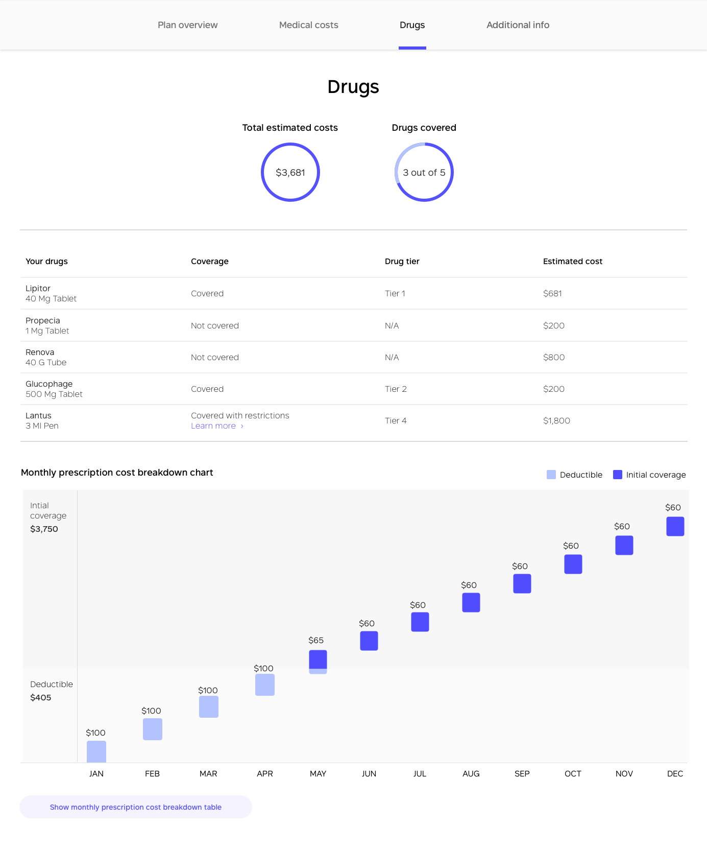
Prescription coverage has four phases. I specified deductibles, out-of-pocket vs. covered costs, coverage gaps (referred to as the Medicare doughnut hole), and prescriptions for each phase in a single responsive chart.
WHAT I LEARNED
DESIGNING EXPERIENCES THAT OVERCOME COGNITIVE BIASES WILL CREATE SUCCESSFUL DECISION-MAKING PROCESSES.
Before this project, I had limited knowledge of how cognitive biases affected user experiences and decisions. I wanted to understand why people made suboptimal choices when it came to retirement. This quest for understanding led me to behavioral economics and choice architecture. I was fascinated by these fields.
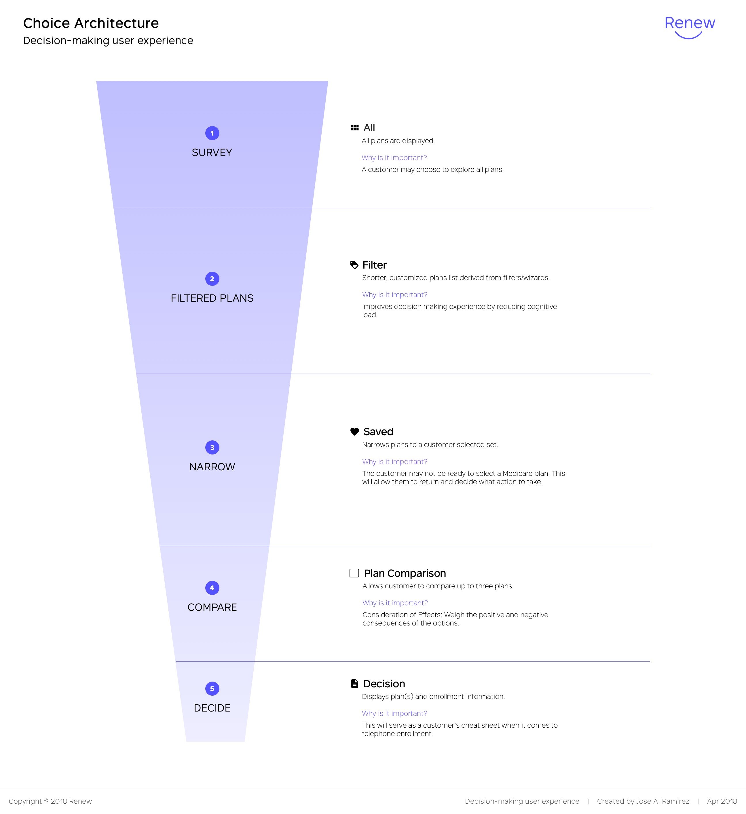
The knowledge acquired was pivotal for creating designs that encouraged users to overcome cognitive biases. I also outlined a decision-making process that served as the framework for the Medicare shopping website. The goal was to instill confidence in users in their health choices, and I love using my superpowers to encourage people to live better lives.
