ANTHEM
PHARMACY BENEFIT MANAGER WEBSITE & APP
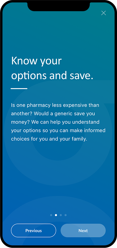
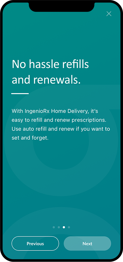
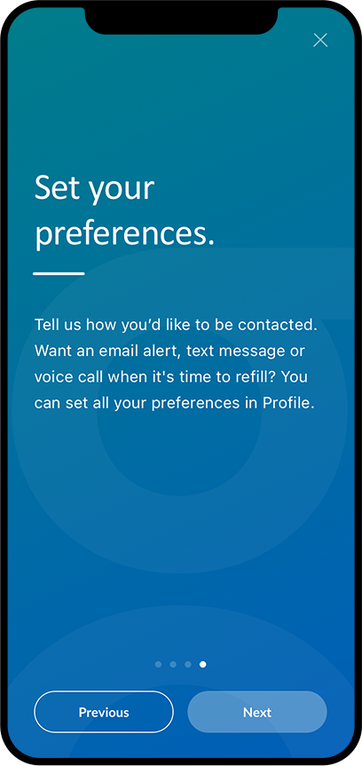
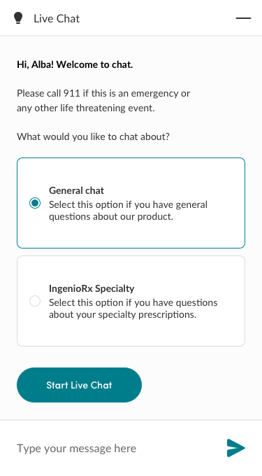
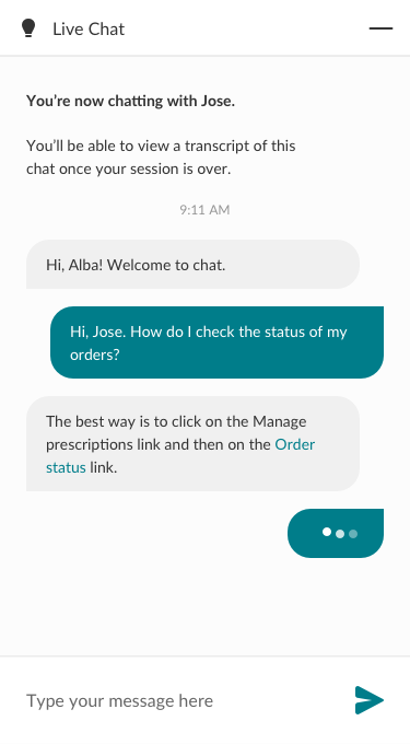
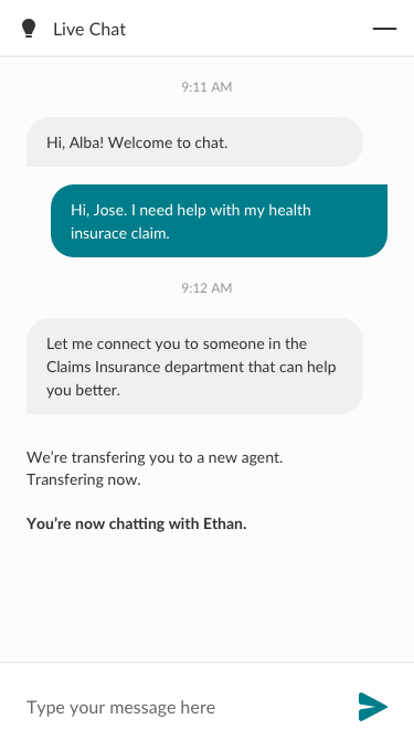
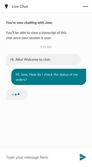
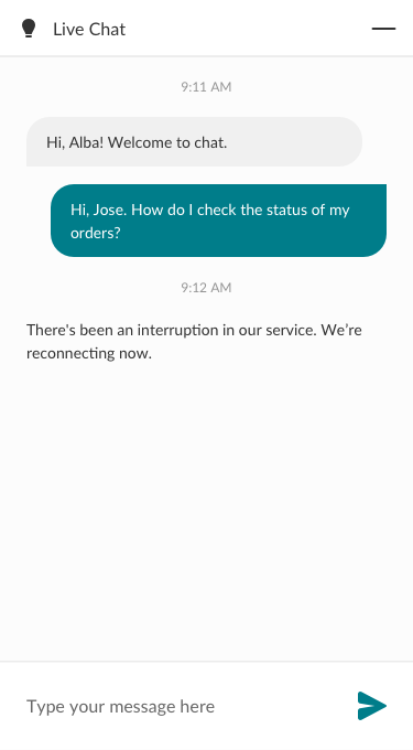
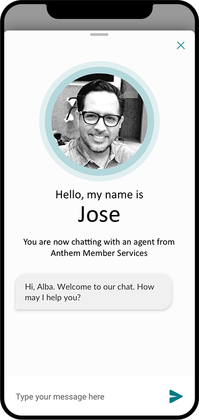
Anthem, the nation's largest health benefits companies, established a new pharmacy benefit manager (PBM) called IngenioRx. This product focused on simplifying prescription drug coverage with the ultimate goal of driving better health outcomes. I was selected to lead this new product's mobile and web UX design efforts for login/registration, SSO, onboarding, navigation, and chat. Here's a case study on how I successfully designed these experiences.
DISCOVERY
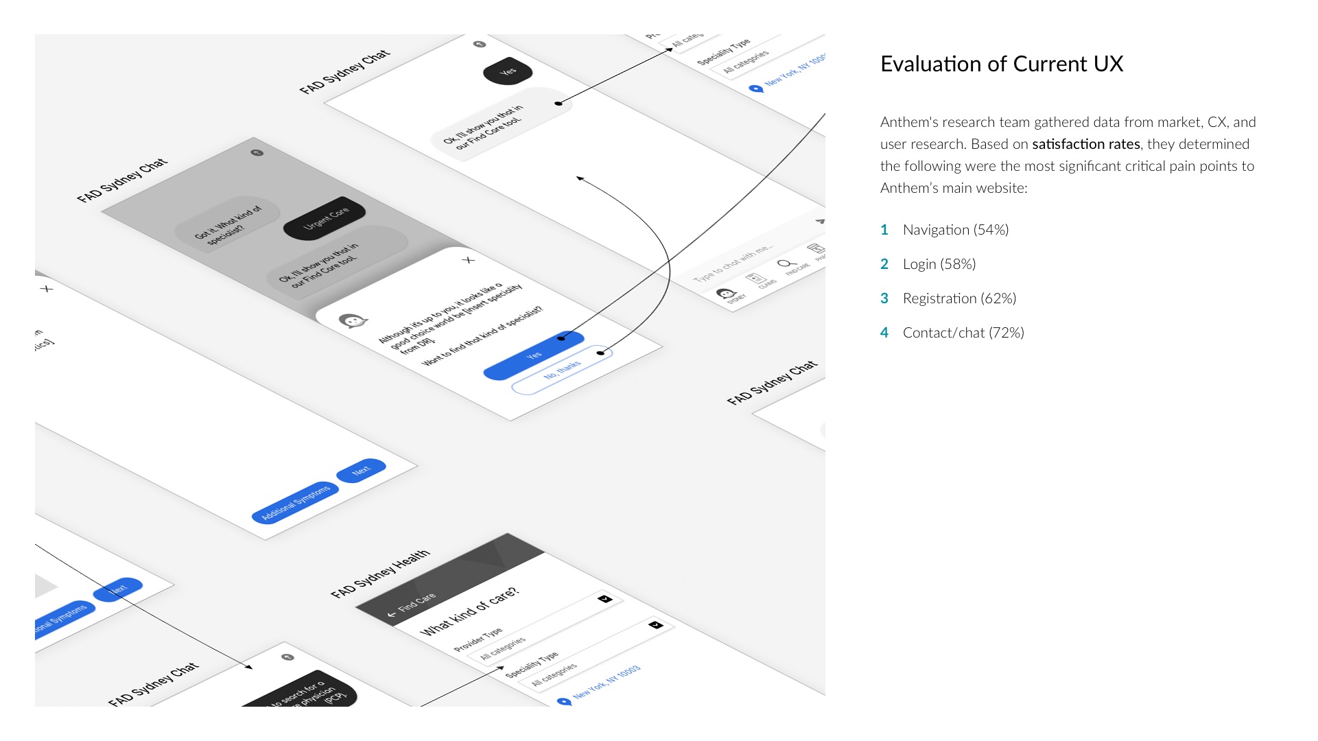
I worked with the marketing and UX research teams during the discovery phase. My goal was to understand the key pain points users were having with Anthem's main website. I saw an opportunity to address them for IngenioRx. Here are some key insights that informed my designs.
40%
of users are not able to login successfully to Anthem.com.
1/2
of users are concerned about others accessing their health information.
29%
of users think Anthem.com is too complicated.
50M
is the average monthly number of visitors to Anthem.com.
37%
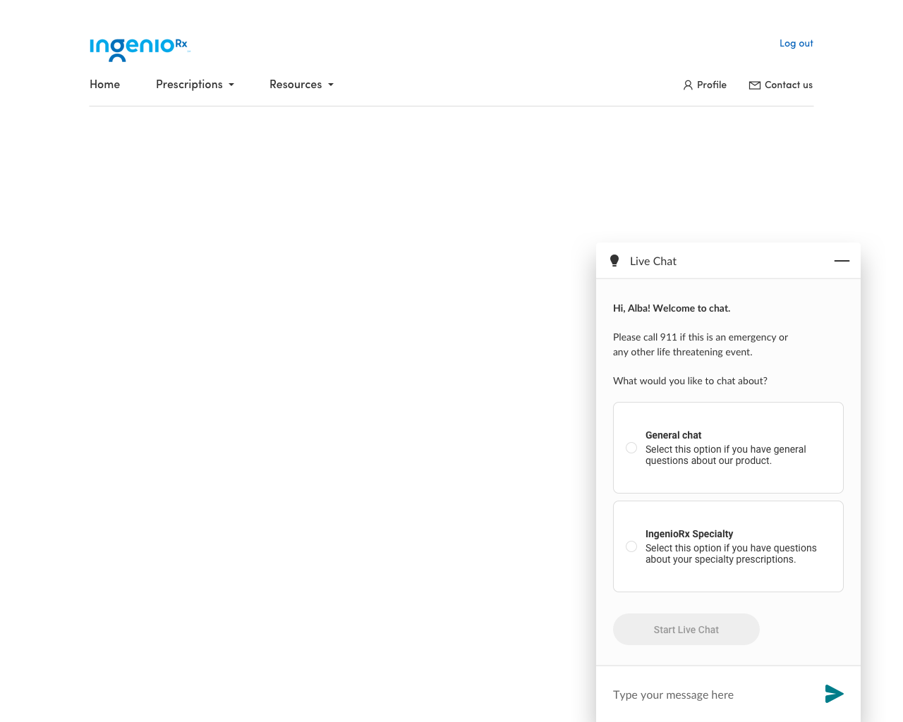
of users were not able to find contact or chat.
25%
of traffic to Anthem.com comes from mobile devices.
DEFINE
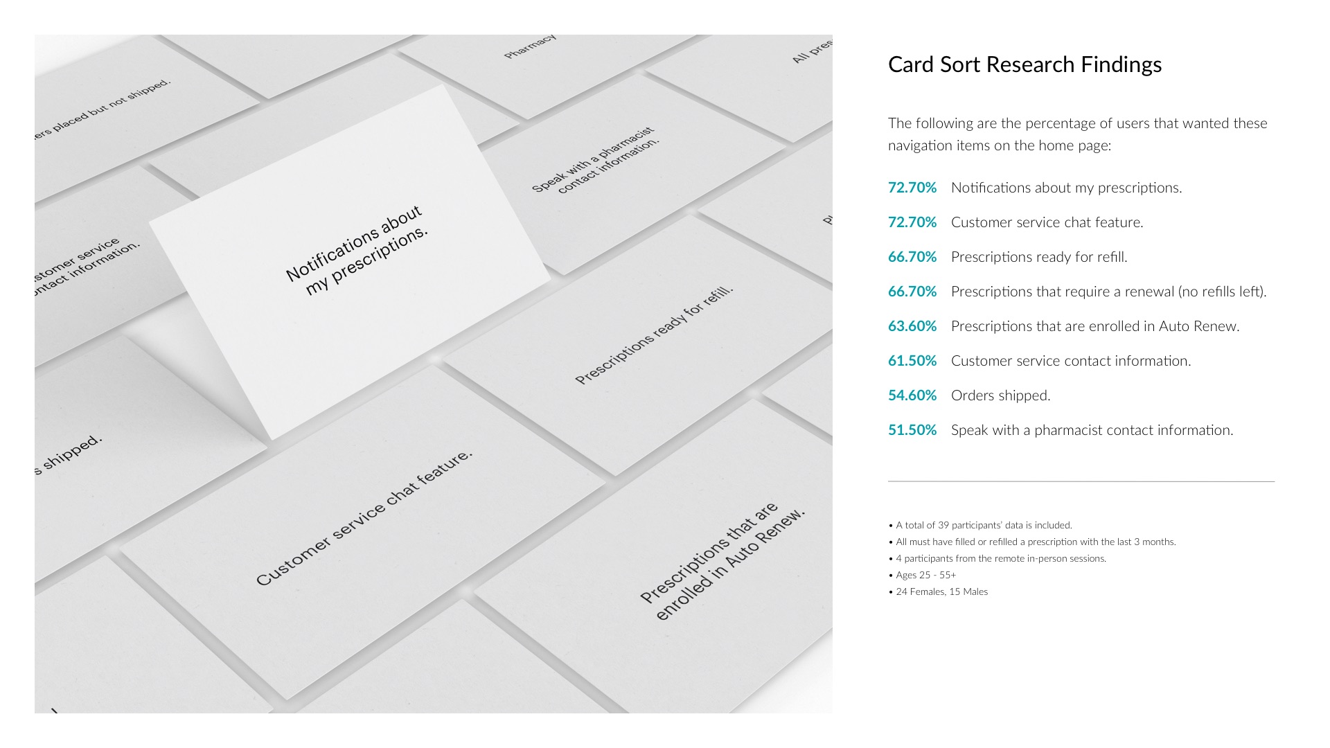
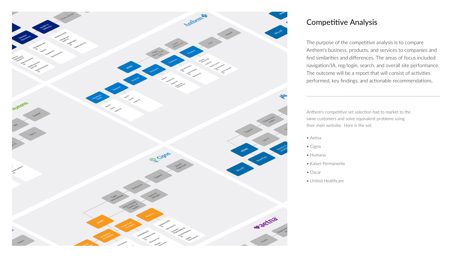
I worked with researchers, content managers, product managers, developers, and executive teams to ideate concepts for the features I needed to design. The solutions I defined came from card sorts, competitive analysis, and heuristic evaluations of current experiences.
NAVIGATION
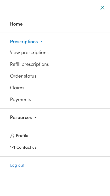
I analyzed our UX research team's card sorts results and determined that users took inventory of their prescriptions, refills, orders, and financial claims. This mental model served as the information architecture I utilized to determine navigation.
RESPONSIVE WEB DESIGN
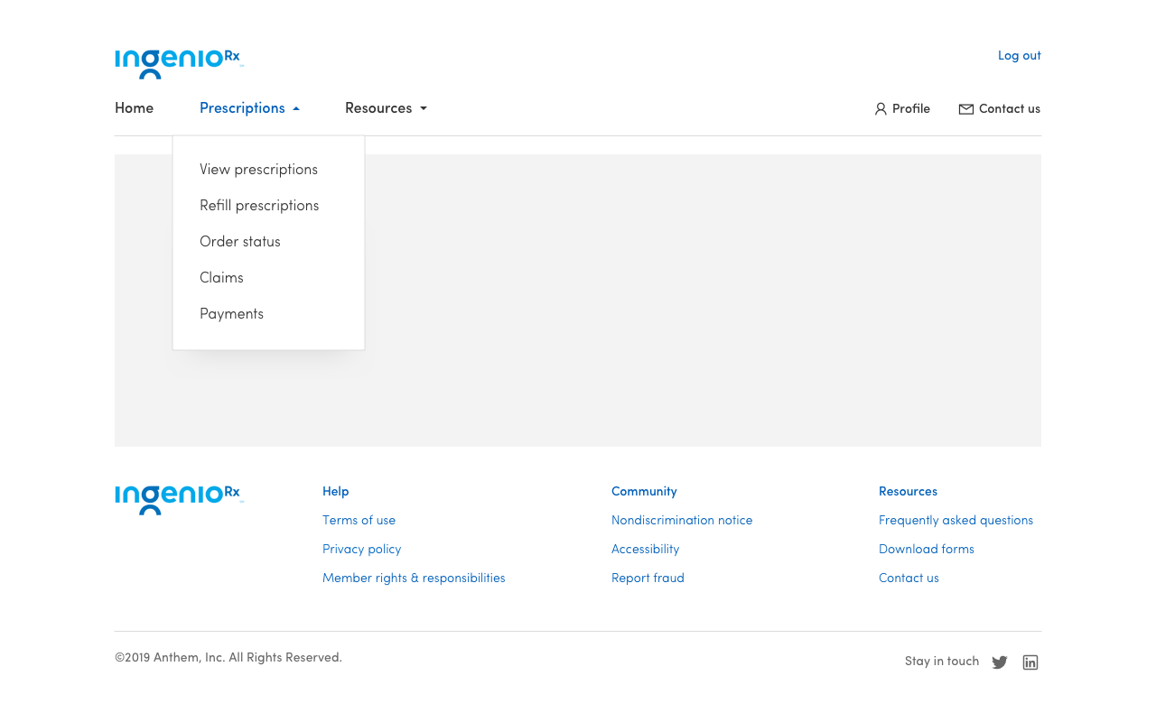
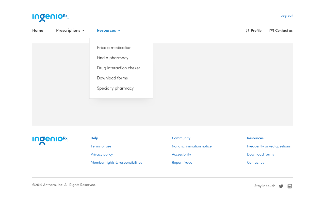
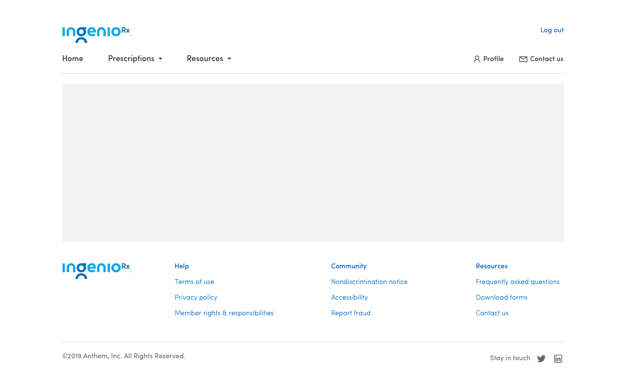
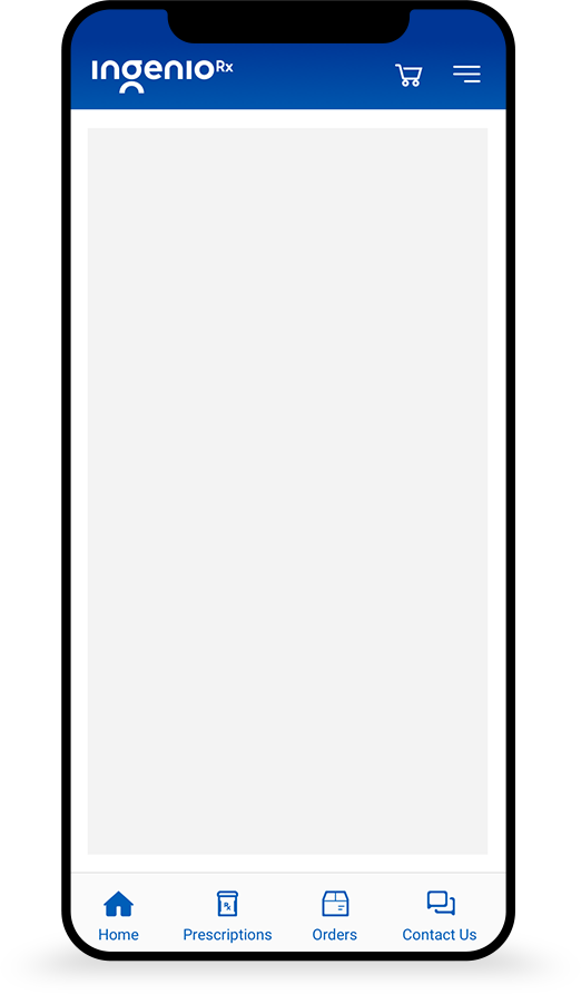
Once our UX research team validated our final navigation scheme, I designed a minimal navigation system that capitalized on existing menu design patterns for responsive web design.
MOBILE NAVIGATION
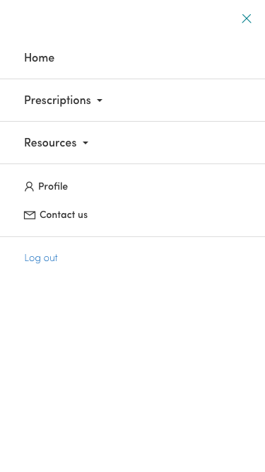
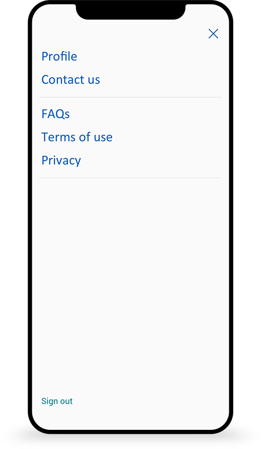
Mobile navigation used a bottom tab bar for the main navigation and a hamburger menu for secondary navigation items.
REGISTRATION & LOGIN
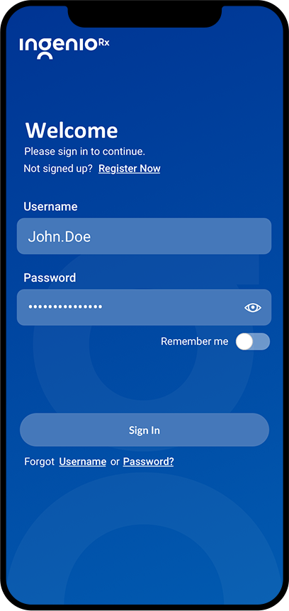
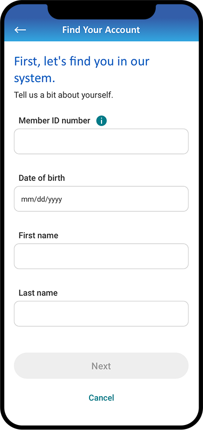
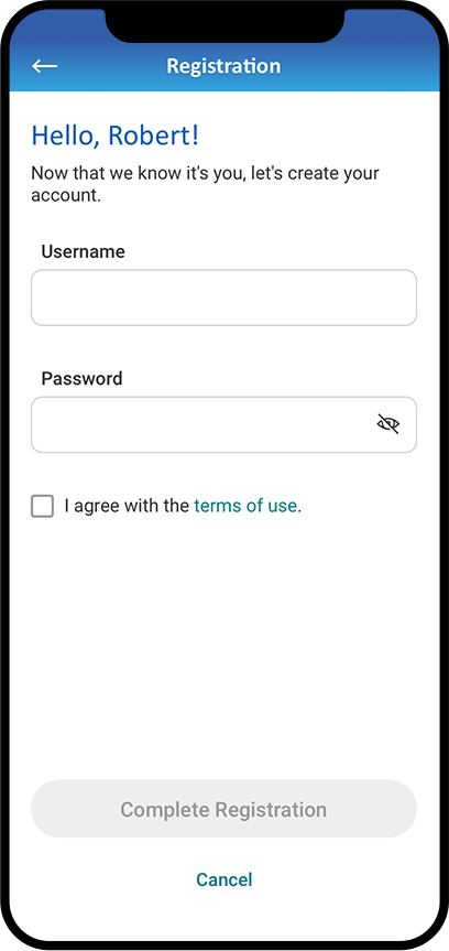
I began my efforts by analyzing behavior flows, traffic drop-offs, and success rates to Anthem.com's existing registration/login experiences. The results included removing self-identification dropdowns, member ID requirements, and most importantly, the dreaded double-masked password entry fields.
TWO-FACTOR AUTHENTICATION
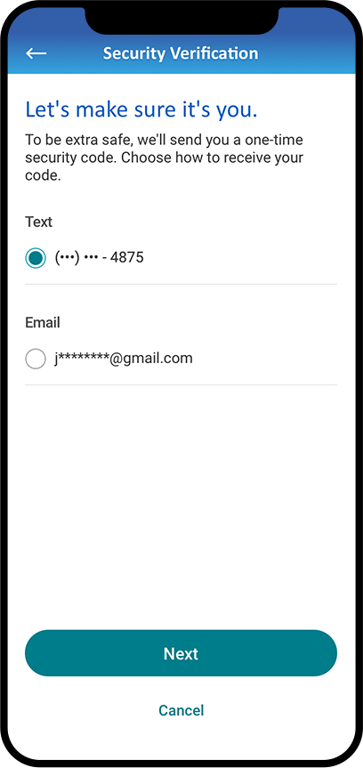
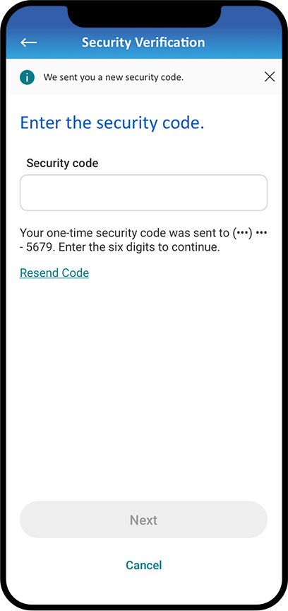
2FA is imperative to healthcare experiences since it fosters trust. I simplified the authentication process by convincing security to remove security questions and pushed for a single phone number.
WHAT I LEARNED
ADDRESSING EXISTING CUSTOMERS PAIN POINTS IS A SOLID STRATEGY FOR NEW PRODUCTS.
As a designer, it's easy to see what other corporations are doing and imitate them. But as a UX professional, the solution has to be custom to an organization's goals and users. That doesn't mean I'll ignore established design patterns or capitalize on the transfer of knowledge. It does mean that I'll need to understand what works and what fails.
Anthem recognized that user login bounce rates were high. They also understood that users were frustrated with not being able to contact them efficiently. Therefore, a critical component to their strategy for IngenioRx centered on addressing customer pain points. The results were that the current login success rate is at 92%, a 32% improvement over Anthem. Additionally, this app has a 4.6-star rating on the App Store. Financially, Anthem reported total revenues of $25.5 billion attributed to IngenioRX, up 11 percent from $22.9 billion recorded in the same period a year prior.
